The Different Types of Collage Design and When to Use Them
You know what’s interesting? Most people think collage editor is just one thing.
Like you open an app, drop some photos, arrange them nicely, and that’s it.
But once you actually start using it, you realize there isn’t just one style. There are many. And honestly, choosing the wrong one can completely change how your design feels.
Sometimes it looks professional, or emotional and sometimes it just feels… off, even if the photos are good.
That usually happens because the type of collage design doesn’t match the purpose.
So instead of forcing one style for everything, it helps to understand a few common types and when they actually make sense.
Grid style (the safe one most people start with)
This is the one you’ve probably seen everywhere.
Everything sits in clean boxes. Equal spacing. Straight alignment. No surprises.
It’s simple, almost predictable—but that’s also why people use it so much.
If you’re showing products, portfolios, or anything where clarity matters more than creativity, this style just works. But yes, it can feel a bit too “template-like” if you use it for emotional content.
Freeform style (the more relaxed one)
This one feels completely different.
Nothing is perfectly aligned. Images overlap. Some are big, some are small. It feels like someone just placed memories wherever they felt right.
And strangely, that’s what makes it interesting.
This style works better when you’re not trying to be formal. Like travel memories, personal posts, or anything emotional. In short, It feels less like design and more like memory on a page.
Story style (when you want people to “follow” something)
This one is not talked about enough.
Instead of just placing photos randomly, you actually arrange them like a small journey.
It could be a business journey, an event, or even a simple day-to-day story.
People don’t always notice it consciously, but they feel it when they look at it.
That’s what makes it powerful.
Minimal style (less effort, more impact)
This one surprises people sometimes. Because you think fewer elements means less attention—but often it’s the opposite.
A few clean images, some empty space, soft tones… and suddenly the focus becomes very clear.
Nothing is fighting for attention. It’s calm, simple and modern.
This is the kind of collage design many brands are quietly shifting toward.
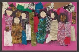
Scrapbook style (the emotional one)
This feels more personal than anything else. It doesn’t try to look perfect at all.
You might see handwritten notes, rough edges, stickers, or slightly uneven layouts. And that’s the charm.
Mixed style (a bit of everything)
Then there’s this one.
Photos + text + shapes + little design elements all mixed together.
It can look very creative when done right, but it can also go wrong quickly if it’s too crowded.
This style is usually used in marketing or social media content where attention is the main goal.
Final thought
Collage design isn’t about picking the most advanced style.
It’s more about matching the style with the message.
Once that clicks, everything else becomes easier. You stop forcing layouts and start choosing what actually fits.
And that’s usually when your designs start looking better—not because they’re more complicated, but because they finally make sense